In today’s dynamic environment, keeping a close eye on performance and managing it effectively is more vital than ever before. Performance management dashboards have emerged as indispensable tools for organizations seeking to stay ahead of the curve by gaining valuable insights into their operations, identifying trends, and making data-driven decisions. Whether you’re a seasoned professional or a budding entrepreneur, mastering the art of navigating these dashboards can be the key to unlocking unparalleled success.
Join us as we embark on a journey to demystify performance management dashboards and discover how they can revolutionize the way you measure, analyze, and enhance performance within your organization. Whether you’re aiming to optimize productivity, track key metrics, or foster a culture of continuous improvement, this guide will serve as your roadmap to navigating success in the dynamic realm of performance management.
LISTEN TO THE PODCAST NOW!
What Is a Performance Management Dashboard?
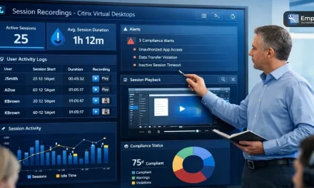
A performance management dashboard serves as a visual aid, offering a quick overview of an organization’s performance by displaying essential metrics and indicators.
It acts as a central place to track how well a company is doing in reaching its goals. It helps us see quickly what’s going well and what needs more focus. The dashboard uses data to help us make decisions based on what’s happening right now, covering everything from money matters to how individuals and teams are doing.
By presenting information in a visually accessible format, the performance management dashboard empowers stakeholders to quickly grasp the overall health of the organization and make informed decisions to enhance efficiency and effectiveness.
It plays a crucial role in aligning teams with strategic objectives, fostering transparency, and promoting a proactive approach to performance optimization.
Benefits Of Performance Management Dashboard
- Real-Time Decision-Making: The ability to access real-time performance data empowers organizations to make informed decisions promptly, enhancing agility and responsiveness.
- Goal Alignment: Employee performance management dashboard visually aligns individual and team efforts with organizational goals, ensuring that actions contribute directly to overarching strategic objectives.
- Efficiency and Optimization: Identification of inefficiencies and areas for improvement enables organizations to streamline processes and optimize resource allocation, enhancing overall operational efficiency.
- Employee Performance Management: Monitoring and visualizing individual and team performance metrics fosters a culture of accountability, aiding in performance reviews, and providing insights for employee development.
- Strategic Insights: Performance management dashboards provide strategic insights by aligning performance metrics with organizational strategies, facilitating data-driven planning and decision-making.
- Continuous Improvement: Serving as a feedback loop, performance dashboards support a culture of continuous improvement, allowing organizations to refine strategies, enhance workflows, and adapt to changing circumstances effectively.
Design An Effective Performance Management Dashboard

Creating a powerful performance management dashboard is essential for leveraging data to make informed decisions and drive organizational success. The design process involves carefully considering key elements to ensure the dashboard is user-friendly, provides relevant insights, and aligns with organizational goals. Here are the essential steps to designing an effective performance management dashboard:
1. Identify And Prioritize Key Performance Indicators (KPIs):
- Define organizational goals and objectives.
- Identify the most critical metrics that align with these goals.
- Prioritize KPIs based on their relevance and impact on performance.
2. Choose the Right Data Visualization Techniques:
- Select visualization methods that effectively communicate information.
- Utilize charts, graphs, and other visual elements to represent data.
- Consider the audience and the nature of the data when choosing visualization types.
3. Develop A User-Friendly Interface And Navigation:
- Design a clean and intuitive interface that is easy to navigate.
- Organize information logically and provide clear pathways for users.
- Use consistent layouts and color schemes for a cohesive user experience.
4. Ensure Real-time Data Updates:
- Integrate systems to enable real-time data updates.
- Implement automated data refresh mechanisms to provide the latest information.
- Ensure that users have access to the most current and relevant data.
5. Customize For Different User Roles:
- Tailor the dashboard to the specific needs of different user roles within the organization.
- Provide customization options for users to personalize their dashboard views.
- Consider the level of detail and granularity required by different stakeholders.
6. Integration With Other Systems:
- Ensure seamless integration with other organizational systems and databases.
- Allow for interoperability to maximize the utility of the dashboard.
- Connect the performance management dashboard with powerful tools like EmpMonitor. EmpMonitor is a comprehensive employee monitoring software designed to enhance productivity, streamline operations, and ensure security within an organization.
Seamlessly integrating organizational systems with EmpMonitor enhances the effectiveness of performance management dashboards. This ensures smooth data flow and empowers informed decision-making. EmpMonitor supplements insights, optimizing productivity, operations, and security measures, thereby fostering organizational success and facilitating growth through comprehensive data-driven strategies.
EmpMonitor: Workforce Management Software

EmpMonitor is a robust and versatile employee productivity monitoring software designed to improve productivity and streamline workforce management.
EmpMonitor significantly contributes to the effectiveness of performance management by providing real-time insights and data that are crucial for evaluating and enhancing employee performance. Here are the key features of EmpMonitor:-
- Data-Driven Decision Making: EmpMonitor captures detailed data on employee activities, such as application usage, website visits, and time spent on tasks. This information is instrumental in making informed decisions about performance improvements, resource allocation, and task prioritization.
- Productivity Analysis: By monitoring work patterns and application usage, EmpMonitor enables performance managers to analyze individual and team productivity. The data helps in identifying peak productivity hours, areas of improvement, and recognizing top-performing employees.
- Performance Metrics: EmpMonitor provides quantitative data on employee performance, including the number of completed tasks, active hours, and adherence to schedules. This data can be integrated- into the performance management dashboard to create comprehensive performance metrics for each employee.
- Time Management: Efficient time management is critical for productivity. EmpMonitor’s time-tracking features assist in understanding how employees allocate their time to various tasks. This data aids in optimizing schedules and ensuring that time is utilized effectively.
EmpMonitor is a valuable performance management tool by provides actionable data, fosters a data-driven culture, and offers insights that contribute to informed decision-making. Integrating EmpMonitor into the performance management dashboard enhances the overall effectiveness of performance management processes within an organization.
7. Mobile Responsiveness:
- Design the dashboard to be responsive across various devices, especially mobile.
- Ensure that users can access and interact with the dashboard on smartphones and tablets.
- Optimize the layout for smaller screens without compromising functionality.
8. Implement User Training and Support:
- Provide comprehensive training for users to navigate and interpret the dashboard effectively.
- Offer ongoing support and resources for users to enhance their skills.
- Request feedback and continuously improve the dashboard based on user input.
9. Prioritize Data Security:
- Implement robust security measures to protect sensitive organizational data.
- Define user roles and permissions to control access to different dashboard features.
- Regularly update security protocols to address emerging threats.
10. Test and Iterate:
- Conduct thorough testing to identify and resolve any usability issues.
- Gather feedback from users and stakeholders for continuous improvement.
- Iterate on the design based on evolving organizational needs and technological advancements.
By following these steps, organizations can create a performance management dashboard that not only meets the unique requirements of the business but also empowers users with actionable insights for better decision-making.
READ MORE
Dashboards: Types, Benefits, And Importance In 2022
Why Is Performance Monitoring Important | 09 Best Practices
Top 5 Productivity Monitoring Software In 2020
Performance Dashboard Examples
Performance dashboards come in various forms, tailored to organizations’ specific needs and goals. Here are a few examples of performance dashboards across different industries:
1. Sales Performance Dashboard:
Purpose: This dashboard is designed to monitor and analyze sales-related metrics to evaluate the performance of sales teams, products, and regions.
Key Metrics:
- Monthly and quarterly sales revenue: Tracks the revenue generated over specific periods.
- Sales growth: Indicates the rate at which sales revenue is increasing or decreasing.
- Conversion rates: Measures the percentage of leads or prospects that result in actual sales.
Visual Representations:
- Bar charts: Display sales revenue for different periods or product categories.
- Line graphs: Show trends in sales growth over time, helping to identify patterns and fluctuations.
- Pie charts: Provide a visual breakdown of sales distribution by region, product, or salesperson.
Functionalities:
- Drill-down capabilities: Allow users to delve into specific regions, products, or salespersons to identify areas of strength and areas needing improvement.
- Performance comparison: Facilitate comparisons between different sales regions, products, or individuals to highlight top performers and areas for optimization.
2. Financial Performance Dashboard:
Purpose: This dashboard provides insights into the financial health and performance of an organization, helping stakeholders make informed decisions.
Key Metrics:
- Profit and loss: Summarizes revenue, expenses, and net income over a specified period.
- Cash flow: Tracks the movement of cash into and out of the organization.
- Return on investment (ROI): Measures the profitability of an investment relative to its cost.
Visual Representations:
- Financial statements: Income and balance sheets offer a comprehensive view of the organization’s financial position.
- Trend lines: Visualize financial performance trends over time, highlighting areas of growth or decline.
- Budget vs. actual comparisons: Compare planned budgets with actual financial outcomes to assess performance against targets.
Functionalities:
- Real-time updates: Provide timely access to financial data to support decision-making.
- Forecasting tools: Enable users to predict future financial performance based on historical data and current trends.
- Expense breakdowns: Offer detailed insights into expenditure categories, helping to identify areas for cost optimization.
3. Project Management Dashboard:
Purpose: This performance management dashboard helps project managers and teams track progress, manage resources, and ensure projects are delivered on time and within budget.
Key Metrics:
- Project timelines: Display project schedules and milestones, indicating progress and deadlines.
- Budget utilization: Track project expenses and ensure they align with the allocated budget.
- Task completion rates: Monitor the progress of individual tasks or project phases.
Visual Representations:
- Gantt charts: Visualize project schedules, tasks, and dependencies over time.
- Burndown charts: Track the completion of tasks or project scope against time, helping to manage workloads and deadlines.
- Resource allocation graphs: Illustrate the distribution of resources across different projects or tasks.
Functionalities:
- Collaboration tools: Facilitate communication and collaboration among team members, enabling effective project coordination.
- Milestone tracking: Monitor progress towards key project milestones and deliverables.
- Risk assessment: Identify and mitigate potential risks that may impact project timelines or outcomes.
4. Educational Institution Dashboard:
Purpose: This dashboard provides insights into the performance and effectiveness of educational programs, student enrollment, and outcomes.
Key Metrics:
- Student performance: Measures academic achievement and progress of students.
- Enrollment rates: Tracks the number of students enrolled in courses or programs.
- Graduation rates: Indicates the percentage of students who successfully complete their studies.
Visual Representations:
- Line graphs or bar charts: Visualize trends in academic achievement over time or across different student cohorts.
- Pie charts or histograms: Provide demographic breakdowns of student populations by characteristics such as age, gender, or ethnicity.
Functionalities:
- Integration with Student Information Systems (SIS): Access real-time student data, including attendance records, grades, and enrollment information.
- Course completion rates: Evaluate the effectiveness of educational programs by tracking the percentage of students who successfully complete their courses.
- Institutional performance tracking: Monitor enrollment trends, graduation rates, and other key metrics to assess the overall performance of the educational institution.
Each performance management dashboard serves specific purposes within its domain, offering a tailored set of metrics, visualizations, and functionalities to support decision-making and performance monitoring.
Wrapping Up
The Performance Management Dashboard is your compass on the journey to success, offering a clear view of your goals, progress, and areas for improvement.
Remember, it’s not just about the numbers; it’s about understanding the story they tell. With the right tools, such as EmpMonitor, and insights, you can steer your professional path in the right direction.
Grab the power of the Performance Management Dashboard as your trusted ally. May your endeavors be fruitful, and your dashboard be a guiding light to navigate the seas of success!