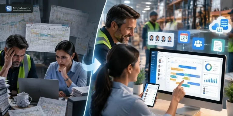
Workforce management platforms are usually judged by their engine – but adoption is decided at the screen. The shift engine can calculate overtime perfectly, the compliance rules can be airtight, and managers will still keep a parallel spreadsheet because publishing a schedule takes nine clicks. Custom front-end development services solve exactly that gap.
The work starts with watching what supervisors, HR coordinators, and hourly staff really do on a shift, then shaping the screens around those habits instead of an org chart. Pages get light enough to open on a five-year-old warehouse handset. The backend stays the same; what changes is that people reach the end of a task instead of quitting halfway. More of the team logs in, fewer of them call support, and the records landing in your HRMS software improve simply because fewer employees are keeping a private spreadsheet on the side.
Why does workforce management software break down at the interface?
Most product budgets go to the engine. Scheduling algorithms, payroll rules, geofenced clock-ins, and integrations eat the roadmap, and the UI gets whatever is left in the final sprint. Teams that bring in custom front-end development services at the design stage, rather than after the first round of complaints, tend to avoid the expensive rewrite that follows a failed rollout.
This is the area where the open-source worker platforms really excel. When a codebase is open, you don’t have to wait for your vendor’s roadmap to include a fiddly approval screen; you can write your own. Companies that select an open-source WFM stack and then develop the interface layer benefit from having an engine that they do not have to create but are guaranteed to work and track shifts, as well as screens that are customized to their shift patterns, terminology, and approval processes.
The symptoms are predictable across HR software development projects:
| Interface problem | What it actually costs |
| Schedule grid rerenders on every cell edit | Managers batch edits offline, data goes stale |
| Desktop-only timesheet approval | Approvals pile up until Monday, payroll runs late |
| 4-second dashboard load on 3G | Field staff stop clocking in through the app |
| Filters buried in a settings modal | Support gets the same ticket 40 times a month |
None of these are backend defects. They are front-end decisions that were never made deliberately.
What front-end development services actually change?
A serious front-end engagement on workforce management solutions touches five layers:
- Data-heavy rendering. A monthly schedule for 300 employees is 9,000 cells (300 people × 30 days). Virtualized tables and windowed lists – techniques that draw only the rows currently on screen – keep the browser handling a few hundred elements instead of thousands, so scrolling stays smooth on mid-range hardware.
- Offline and flaky-network behavior. Clock-ins stored locally in the browser (IndexedDB) and synced on reconnect stop the “I punched in, the app ate it” argument.
- Role-specific screens. A shift lead needs three actions on one screen. An HR director needs filters and export. Serving both the same dashboard fails both.
- Accessibility and localization. Keyboard-navigable approval flows and right-to-left support are far cheaper to build in than to retrofit.
- Design systems. A shared component library keeps the fifth module consistent with the first, which is where most in-house teams drift.
How does front-end performance improve daily workforce operations?

The business case is arithmetic, not opinion. Take a mid-size operation with 40 line managers, each making roughly 12 schedule edits per shift. If an interface rework saves four seconds per edit, that is 1,920 seconds a day, about 32 minutes across the team. Over 21 working days, roughly 11 hours a month recovered from clicking. Multiply by the number of sites, and the redesign pays for itself long before the annual license renewal.
There are two costs that rarely make it into a business case, and both are larger than the clicking time. The first is onboarding. A new supervisor who needs a two-hour walkthrough before they can publish a schedule is a recurring expense in any operation with normal turnover; a screen that explains itself turns that into fifteen minutes of shadowing. The second is the shadow system. Every spreadsheet a manager keeps “just to be safe” is a copy of your workforce data that payroll cannot see, auditors cannot trace, and no one updates on holiday. Interface work is the cheapest way to bring that data back inside the platform.
There is a scheduling cost too. When approvals are stuck on a desktop-only screen, a manager on the floor cannot sign off a swap request until they return to a laptop – so understaffed shifts stay understaffed for hours longer than they need to. Mobile approval screens do not just save clicks; they shorten the gap between a problem appearing and someone being allowed to fix it.
Framework choice matters less than how you render – though React and Angular ecosystems give you the virtualization libraries to do it.
| Approach | Best fit in WFM | Trade-off |
| Client-side SPA | Interactive schedule builders, drag-and-drop shifts | Heavier first load |
| Server-side rendering | Employee self-service portals, public schedules | More infrastructure |
| Progressive web app | Field clock-in, mobile approvals | Limited native device APIs |
One nuance that surprises teams: the slowest screen is rarely the one users complain about. They complain about the screen they open twenty times a day, even if it loads in 900ms. Instrument usage first, then optimize.
Front-end development services and the HR software development roadmap:
But interface work is not a one-shot affair. Labor law evolves, unions renegotiate, and each new country has a line on a form that has to be completed on a cell phone. It makes sense to use tailored front-end development services in a ‘rolling’ fashion when you are going through your release cycle and not just as one big redesign sprint.
Sequencing that tends to hold up in practice:
- Q1: audit, instrumentation, and design system foundation.
- Q2: rebuild the two highest-traffic screens and measure adoption change.
- Q3: mobile self-service and offline sync.
- Q4: reporting, exports, and accessibility certification.
Teams buying custom front-end development and integration services as a bundle should still keep the interface backlog visible and separately estimated. When UI work is folded silently into backend tickets, it gets cut first, and the same adoption problem returns a year later.
What goes wrong without it:
The common failure is a beautiful redesign that ignores the shift floor. One pattern repeats: a clean, whitespace-heavy dashboard ships; it looks excellent in the demo; and then supervisors discover they can see six shifts on screen instead of the twenty-four they used to see in the old cramped table. Density is a feature in workforce tools. So is the ugly bulk-edit button that power users rely on. Any front-end partner who wants to remove both without measuring usage first is designing for the sales deck.
The second failure is treating mobile as a scaled-down desktop. Clock-in, swap requests, and availability updates deserve purpose-built screens. Everything else can stay on the laptop.
Good interface work in workforce management solutions is unglamorous. It is virtualized lists, sensible defaults, fewer modals, and honest performance budgets. But it is the difference between a platform your team is told to use and one they choose to open.