

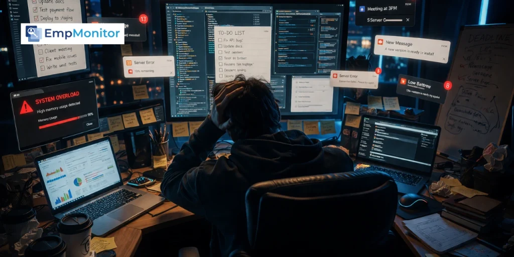
Most people reach for a productivity dashboard only after they realize the tools they rely on were never built to show real progress, only to capture activity.
To-do lists get things checked off. Spreadsheets store endless data. Task trackers show movement. But none of them clearly answer a simple question: what actually moved forward?
You can see what you did, but not what it led to. Effort is visible. Outcomes are not. And over time, that disconnect makes it harder to tell whether your work is creating real progress or just maintaining motion.
In this blog, you’ll understand what a productivity dashboard actually is, how it closes this visibility gap, and how to use it to track work in a way that reflects real outcomes, not just activity.
Listen To The Podcast Now!
What Is a Productivity Dashboard?


A productivity dashboard is a visual system that shows how your work is actually progressing, not just what you’re doing, but what your work is producing.
Instead of scattered tasks, tools, and data, it brings everything into one place and highlights the metrics that matter, like completed outcomes, time spent, bottlenecks, and progress toward goals.
The key difference is this:
- Most tools show activity (tasks, emails, hours)
- A productivity dashboard shows impact (what moved forward, what didn’t, and why)
At its core, it helps you answer three critical questions:
- What did I (or my team) actually accomplish?
- Where is work getting stuck or slowed down?
- Are our efforts leading to real progress?
It turns your work from something you feel into something you can see and evaluate clearly.
What Changes When You Start Using Productivity Dashboard
You Stop Confusing Activity With Progress
Sending fifty emails is an activity. Closing a deal is progress. The problem is that both feel like work when you’re in the middle of them, and without visibility, you can’t tell which one you spent the week doing.
A productivity dashboard separates the two. It shows you what’s completed versus what’s actually moved a goal forward. That distinction alone changes how people prioritize. Once you see it visually, the pattern becomes hard to ignore.
You Start Noticing Patterns You Were Blind To
Time leaks don’t announce themselves. They show up as a vague sense that the week disappeared without much to show for it. A dashboard makes those leaks visible. You might notice that Tuesdays are consistently low-output days. Or that certain project types always stall at the same stage. Or that a specific workflow step is taking three times the time it should.
You can’t fix what you can’t see. And you can’t see what you haven’t tracked in a meaningful way.
Decisions Become Faster (and Less Emotional)
One of the quietest drains on any team or individual is decision fatigue fueled by ambiguity. When you’re not sure how things are going, every call becomes a judgment call made from instinct. Sometimes that works. Often it doesn’t.
When a productivity dashboard surfaces real data, the guesswork shrinks. You’re not asking “how do you think the project is going?” You’re looking at completion rates, timelines, and output patterns. Decisions become grounded, faster, and easier to defend.
Types of Productivity Dashboards (And Who They’re For)
")
Treating all dashboards as interchangeable is one of the most common mistakes. Using the wrong type for your context doesn’t just fail to help; it actively adds confusion.
Personal Dashboards (Control Your Day)
These are built for individual use. They track habits, focus blocks, deep work hours, and personal goals. The purpose is self-awareness and daily discipline. A freelancer tracking which projects get the most focused hours is a good example of where a personal dashboard shines.
Team Productivity Dashboards (Control the Flow of Work)
A team productivity dashboard focuses on collaboration, shared deadlines, task ownership, and accountability. It answers questions like: Who’s blocked? What’s overdue? Where is the bottleneck? When teams operate without this kind of shared visibility, miscommunication fills the gaps.
Workforce Productivity Dashboards (Control Outcomes at Scale)
This operates at the department or company level. A workforce productivity dashboard tracks performance across roles, teams, and functions. It’s less about individual tasks and more about whether entire workflows are producing the expected outcomes at the expected pace.
Productivity Analytics Dashboards (Control Decisions)
This is the most strategic layer. A productivity analytics dashboard goes beyond current performance; it identifies trends, forecasts capacity, and informs long-term decisions. It’s where leadership stops asking “how did we do?” and starts asking “where are we heading, and why?”
Each type serves a different audience with different questions. Knowing which one you actually need is half the battle.
What a Productivity Dashboard Looks Like in Real Life
Abstract concepts are easy to nod at. Stories make them stick.
A freelancer managing six simultaneous clients had a to-do list that never got shorter. Every morning felt like triage. After building a simple productivity dashboard that tracked time per client, deliverable status, and revenue per hour, the picture changed fast. Three clients were consuming 70% of her time but generating 30% of her income. That data made a difficult conversation much easier to have.
A product team missing sprint deadlines repeatedly didn’t know where to look. The dashboard wasn’t tracking individual output; it was tracking handoff delays between design and development. One stage, consistently late, was creating a cascading effect that nobody had made visible. Once surfaced, a single process change fixed four weeks of missed timelines.
A company guessing at department performance made headcount decisions based on assumptions. A workforce productivity dashboard showed that one team was overloaded by 40% while a parallel team was underutilized. Resources were redistributed. Output improved without a single new hire.
The tool doesn’t perform magic. It just removes the fog.
EmpMonitor: A Practical Look at How Productivity Dashboards Work


A productivity dashboard becomes easier to understand when you see it in a real system. EmpMonitor is one such example that organizes workplace activity into clear, structured insights instead of scattered information.
At its core, it works as a centralized system for workforce visibility and productivity tracking, helping teams move beyond simply seeing what work is being done to understanding how effectively that work is actually progressing.
What it helps manage inside a productivity dashboard system:
- Real-time activity tracking
Monitor live application usage, website activity, and employee status (active/idle) from a single dashboard. - Time tracking & attendance insights
Tracks working hours, login/logout times, and attendance patterns to understand actual productive time. - Project and task visibility
Helps teams assign work, track progress, and identify delays across ongoing projects. - Workforce productivity analysis
Provides structured reports on work patterns, helping identify inefficiencies and performance trends. - Screen-based activity insights (for review purposes)
Captures work activity logs and screen records for compliance, training, and performance review needs.
Read More
Boost Employee Productivity With Effective Software Solution
How To Use Time Tracking Software To Boost Your Freelancing Career
How to Build a Productivity Dashboard That Actually Works

Start With One Question: “What Does Progress Look Like?”
Before you build anything, define what success looks like in measurable terms. Not “be more productive.” Something real: ship two features per sprint, close five deals per month, reduce average response time to under four hours. Your dashboard should be built backwards from that definition.
Track Less But Track Right
Resist the urge to measure everything. Three to five meaningful metrics beat fifteen forgettable ones. If you can’t explain why a metric is on the dashboard in one sentence, it probably shouldn’t be there.
Design for Clarity, Not Complexity
If it takes more than ten seconds to understand what a dashboard is telling you, it needs a redesign. Simplicity isn’t laziness, it’s usability. Colour, hierarchy, and layout should make the most important information impossible to miss.
Make It Impossible to Ignore
A dashboard that lives in a folder nobody opens is worse than no dashboard at all. Build daily visibility into the habit. A quick morning check, a shared team view in a standing meeting, a weekly review ritual. The best productivity dashboard workspace is one that people actually use.
Use It to Decide, Not Just Review
A dashboard is not a report. It should trigger action, not just record history. If you’re looking at it and not making any decisions or adjustments, something’s off. Ask yourself after every dashboard review: What am I doing differently because of what I just saw?
Why Most Productivity Dashboards Fail
They Track Everything So Nothing Stands Out
A dashboard crammed with metrics trains the brain to tune out. When everything is visible, nothing is prioritized. The result is information overload that somehow still leaves people with no clarity.
They’re Built Once and Never Used Again
Initial setup energy is high. Sustained use drops off fast. Dashboards that aren’t reviewed consistently become relics. They sit there, technically functioning, quietly useless.
They Don’t Connect to Real Goals
The most common failure: a dashboard full of operational data that never touches the actual goals of the team or business. Tracking tasks completed means nothing if you never asked whether those tasks were the right ones to begin with.
They Feel Like Surveillance, Not Support
When dashboards are rolled out without context, people assume the worst. Monitoring. Micromanagement. Distrust. That psychological resistance is real, and it kills adoption. The framing matters enormously. A dashboard should feel like a shared tool for clarity, not a report card.
Conclusion
Most people stay busy but can’t clearly see what they’ve actually achieved because most tools track activity, not outcomes. A productivity dashboard solves this by turning scattered work data into a single, clear view of progress, efficiency, and goal alignment.
It helps separate busywork from real impact, surface inefficiencies, and support faster, data-driven decisions. The blog also covers dashboard types, real use cases, and how systems like EmpMonitor apply this through real-time tracking and productivity insights.
In short, it shifts focus from what you did to what actually moved forward.
FAQs
What is the difference between a productivity dashboard and a project management tool?
A project management tool focuses on organizing and assigning tasks, while a productivity dashboard focuses on measuring outcomes and performance. In simple terms, project tools manage work execution, whereas dashboards help evaluate how effectively that work is performing.
Can a productivity dashboard be used for personal use or only for teams?
Yes, a productivity dashboard can be used individually as well as in teams. Personal dashboards help track habits, focus time, and daily output, while team dashboards focus on collaboration, deadlines, and shared performance metrics.
What are the most important metrics to include in a productivity dashboard?
The most effective metrics depend on your goals, but commonly used ones include output completed, time spent on tasks, task completion rate, and progress toward defined goals. The key is to track metrics that reflect outcomes, not just activity.
Do productivity dashboards actually improve productivity or just track it?
A productivity dashboard doesn’t directly increase productivity; it improves awareness. Making work visible and measurable, it helps identify inefficiencies and better decision-making, which indirectly leads to improved productivity over time.
How do you know if your productivity dashboard is effective?
A productivity dashboard is effective if it leads to better decisions, clearer priorities, and reduced confusion about work progress. If it only shows data but doesn’t influence action or improvement, it is not being used effectively.