Complex data is overwhelming in any company, and it is important to find a way to make sense out of it. Visualization is an important aspect because it helps teams to view the bigger picture and comprehend trends better.
That is the place of AI-driven presentations: an AI presentation maker combines artificial intelligence and intelligent design to transform complex productivity insights into intelligible and simple graphics.
With AI in presentation design, it will be possible to emphasize valuable insights, direct decision-making, and assist employees, managers, and leaders in improving the workflow more efficiently.
Why AI Presentation Design Matters for Productivity Insights?


Productivity insights only create impact when they are communicated clearly and quickly. Teams often lose valuable time interpreting complex dashboards, reports, or spreadsheets, which slows down decision-making.
AI-powered presentation design bridges this gap by transforming AI-generated data insights into structured, visual narratives that highlight what truly matters, performance gaps, efficiency trends, and actionable opportunities. AI.Decksy now transforms this process, using AI to automate routine presentation tasks and turn complex data into polished, actionable insights.
Minimizing manual effort, it allows teams to focus on interpreting results and making informed decisions while delivering presentations that are professional, impactful, and tailored to the audience.
An effective AI-based presentation will achieve a balance between information and action. It enables users to:
- Understand performance, efficiency, or engagement trends swiftly.
- Discover the areas and bottlenecks requiring attention.
- Make decisions that are informed and based on clear and context-rich information.
Using the analytical capability of AI with the presentational design, it becomes possible to transform raw data on productivity into insights that would be easy to comprehend and respond to.
Important Rules For AI Productivity Insights Presentation

To make AI productivity insights truly impactful, presentations must simplify complex data, emphasize key priorities, and guide clear actions. Below are the essential principles to follow when creating productivity-focused presentations.
Visual Hierarchy
Not all data is created equal. The visual hierarchy of metrics is effective in drawing the attention of users to the most important issues. Emphasize important productivity metrics by use of charts, graphs, and color coding. Highlight the patterns and the outliers to underscore trends that are recognizable. Maintain consistent design items to minimize cognitive load and increase clarity.
As an example, a dashboard with the project completion rates could have bold colors on the delayed projects and light colors on the on-track items. This enables managers to identify problem areas at a glance.
Action-Oriented Summaries
Information can never be useful unless it brings about action. AI presentations must have short overviews with additional recommended steps.
Be specific with the definition of the data. Focus on real-life results and not statistics.
Provide information on how users should proceed further to improve the results.
For example, a drop in team productivity over the past week should not be presented as a standalone statistic. Instead, the presentation should highlight the underlying factors contributing to the decline and recommend practical actions to address them effectively.
Contextualization
Contextually invalid metrics are deceptive. AI productivity insights should never be presented as isolated metrics. Numbers gain real meaning only when placed within the context of business goals and team objectives. Effective presentations clearly demonstrate how individual or team performance aligns with strategic priorities and explain how emerging trends can influence overall business outcomes.
Rather than displaying statistics in isolation, AI-driven presentations should connect insights to real-world implications.
For example, if AI highlights reduced customer support response times, the presentation should also explain how this improvement impacts customer satisfaction, retention, and long-term business growth.
Best Practices In AI Presentation Design

In addition to the main principles, AI-powered presentation design has a number of best practices that can make it effective and engaging.
Interactive Dashboards
Interactive dashboards enable the user to filter, drill down, and learn the data in their own way. Users are able to see data at the team, department, or individual level.
Drill-down facilities can be used to find out the underlying causes of trends or bottlenecks.
Engagement and in-depth analysis are promoted with the use of interactive tools.
As an illustration, a sales productivity dashboard can enable managers to narrow down to region, product line, or sales rep to determine who is doing the job or where assistance is to be provided.
Automated Narratives
Complex metrics become easier to understand because AI can generate natural-language explanations for data points, turning numbers into meaningful stories. Teams still need an AI humanizer tool to keep those narratives transparent and trustworthy. These explanations reveal the reasons behind performance trends, reduce the need for manual report interpretation, and make insights accessible to non-technical stakeholders.
For example, an AI-generated monthly performance report might explain: “Team A missed project deadlines by 15% due to uneven resource allocation and increased workload during peak periods.”
Personalization
The most effective AI productivity insights presentations are tailored to specific roles, preferences, and workflows. Employees should see only the metrics relevant to their responsibilities, while managers receive concise, high-level summaries. Leadership teams, on the other hand, should be presented with dashboards focused on strategic objectives.
By personalizing insights at each level, AI prevents information overload and ensures every audience receives actionable data they can directly use to make informed decisions.
Types Of Effective AI Presentation Formats
The use of AI in presentation design is diverse. Various forms can make the best use of productivity insights depending on the application.
| Format | Use Case | Benefits |
| Dashboard | Real-time productivity tracking | Quick overview, actionable alerts |
| Infographic | Weekly productivity summary | Visual storytelling, easy sharing |
| Automated Report | Monthly performance analysis | Detailed insights, narrative explanations |
All different formats have their own benefits: dashboards provide you with awareness in real-time, infographics describe trends visually and are shareable, and automated reports provide a deep analysis in a narrative format.
How AI Presentations Empower Teams and Leaders?

AI-based presentations are advantageous to both the individual employees and the organizational leaders:
For Employees
Visual representations of personal performance metrics help employees clearly understand their individual contributions. By highlighting weak areas and opportunities for improvement, AI-driven insights encourage proactive problem-solving. Practical, well-presented insights also improve focus and efficiency.
For example, an AI-powered dashboard can display project completion rates alongside time-management recommendations, helping employees optimize their workflows and work more effectively.
For Employers
Transparency in team performance encourages data-driven decision-making. Clear insights help leaders identify where support, recognition, or additional training is needed, while reducing reliance on subjective evaluations. By transforming raw productivity data into easy-to-understand visuals and narratives, AI presentation design enables better resource management and supports sustainable organizational growth.
Artificial Intelligence In Management and Workplace Surveillance

Real-time AI analytics dashboards give managers continuous visibility into operational efficiency. They track key metrics such as performance, engagement, and process efficiency, helping identify anomalies or areas that need immediate attention. By automatically generating consistent slides and reports, AI saves time and ensures reporting accuracy.
These dashboards are especially valuable for performance reviews, training planning, and policy updates. With AI-powered templates and automation reducing manual effort, managers can focus more on strategic decisions rather than routine reporting tasks.
Turning Insights into Actuals
The final aim of AI presentation designing is the ability to turn data into a source of action. The following benefits may be anticipated in such organizations that apply these principles:
- Quicker, Data-Driven Decisions: Forward-looking insights are clear and actionable in nature, which means that the time needed to interpret and analyze data is lessened.
- Enhanced Productivity: The employees and teams are able to detect and solve inefficiencies in a relatively short period.
- Improved Interaction: Visual, interactive, and personalized displays improve how quickly users engage with and respond to data.
- Strategic Alignment: When productivity insights are contextualized and actionable, they guide decisions that support overall business objectives.
Combining the analytical strength of AI with the careful design will ensure that the productivity insights are no longer informative in nature but truly transformative.
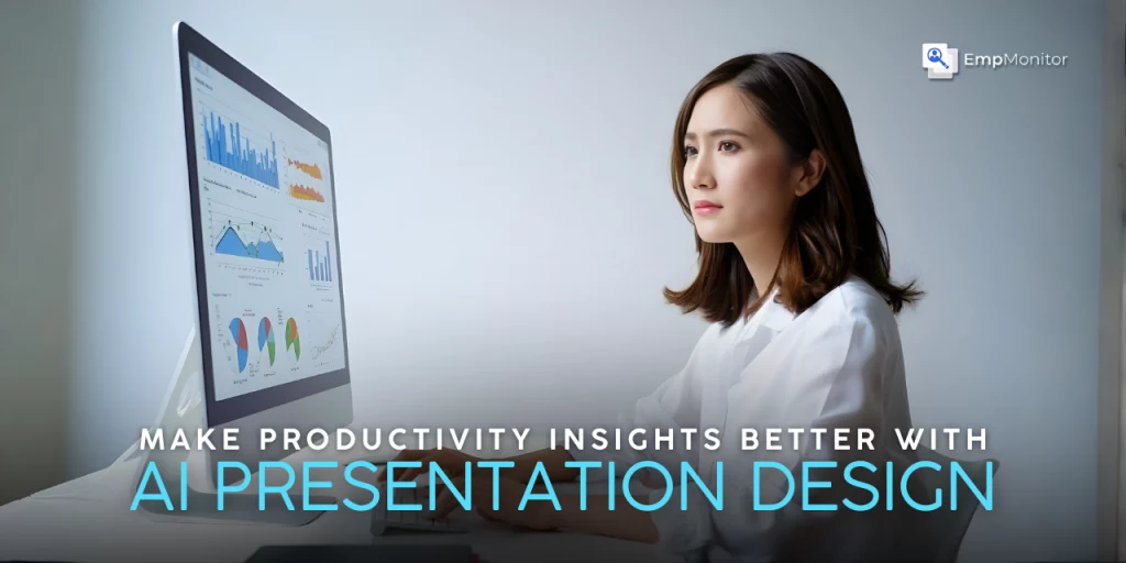
To gather accurate productivity insights, tools like EmpMonitor are invaluable. It helps managers track employee performance, monitor workflow efficiency, and gather data-driven insights. EmpMonitor also offers powerful data visualization features, such as graphs showing idle and productive time, allowing teams to easily interpret performance trends. This enables informed decision-making and highlights areas for improvement in real-time, making the data both actionable and insightful.
Conclusion
The use of AI in presentations is transforming the way companies use productivity knowledge. Businesses can render data accessible, interesting, and actionable by focusing on visual hierarchy, action-oriented summaries, and contextual relevance as well as through the use of interactive dashboards, automated narratives, and personalization. Applied to employees, managers, or executives, AI-driven presentations can assist in converting complicated production measures into well-informed decisions that would make efficiency, effectiveness, and business success.